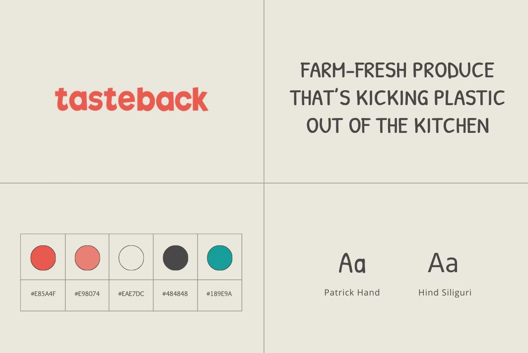
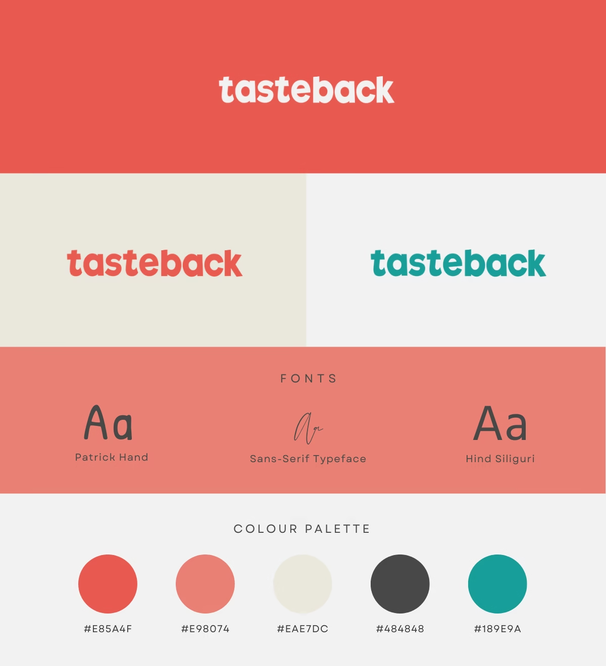
Visual Identity Design @ Tasteback

Codrin Platon
Digital Marketer


I thoroughly enjoyed working with Codrin at Tasteback, where his expertise in digital marketing and web development made a significant impact. His creativity, strategic thinking, and data-driven approach helped us develop effective campaigns, optimise our website, and improve SEO, all of which enhanced our online presence. Codrin is a collaborative team player who consistently delivers results. If you’re looking for a digital marketer who combines data with creativity, I highly recommend him